UniPrep101

UniPrep101

UniPrep101

Mobile & Web

Consumer

Information Architecture

Product Strategy

Mobile & Web

Consumer

Information Architecture

Product Strategy

UniPrep101 is a premium education startup offering in-person pre-college bootcamps in Singapore. The platform helps students and parents explore programs, understand outcomes, and begin the enrollment process through a clear and trustworthy digital experience.

ROLE

Founding Product Designer

DELIVERABLES

UX Research, Information Architecture, UI Design, Design System, Brand Identity

TEAM

Founder

Product Designer
2 Engineers

TIMELINE

Aug - Nov 2025

Impact

Impact

Impact

0→1

built from scratch

2 audiences

students and parents

8 Weeks

delivery

End-to-End

branding + UX

Challenge

Challenge

UniPrep101 needed its first digital presence to introduce premium pre-college bootcamps for students in India and the UAE. The experience had to build credibility with parents, excite prospective students, and communicate detailed program information in a way that felt approachable rather than overwhelming.

UniPrep101 needed its first digital presence to introduce premium pre-college bootcamps for students in India and the UAE. The experience had to build credibility with parents, excite prospective students, and communicate detailed program information in a way that felt approachable rather than overwhelming.

My Role

My Role

As the founding product designer, I partnered closely with the founder to shape the product vision from the ground up. I led UX strategy, information architecture, visual design, branding, and the responsive website experience, collaborating with engineering during implementation.

As the founding product designer, I partnered closely with the founder to shape the product vision from the ground up. I led UX strategy, information architecture, visual design, branding, and the responsive website experience, collaborating with engineering during implementation.

Outcome

Outcome

Delivered a launch-ready digital experience including a responsive website, design system, visual identity, and marketing collateral, providing UniPrep101 with a cohesive foundation for attracting prospective students and parents.

Delivered a launch-ready digital experience including a responsive website, design system, visual identity, and marketing collateral, providing UniPrep101 with a cohesive foundation for attracting prospective students and parents.

01

Building the Foundation

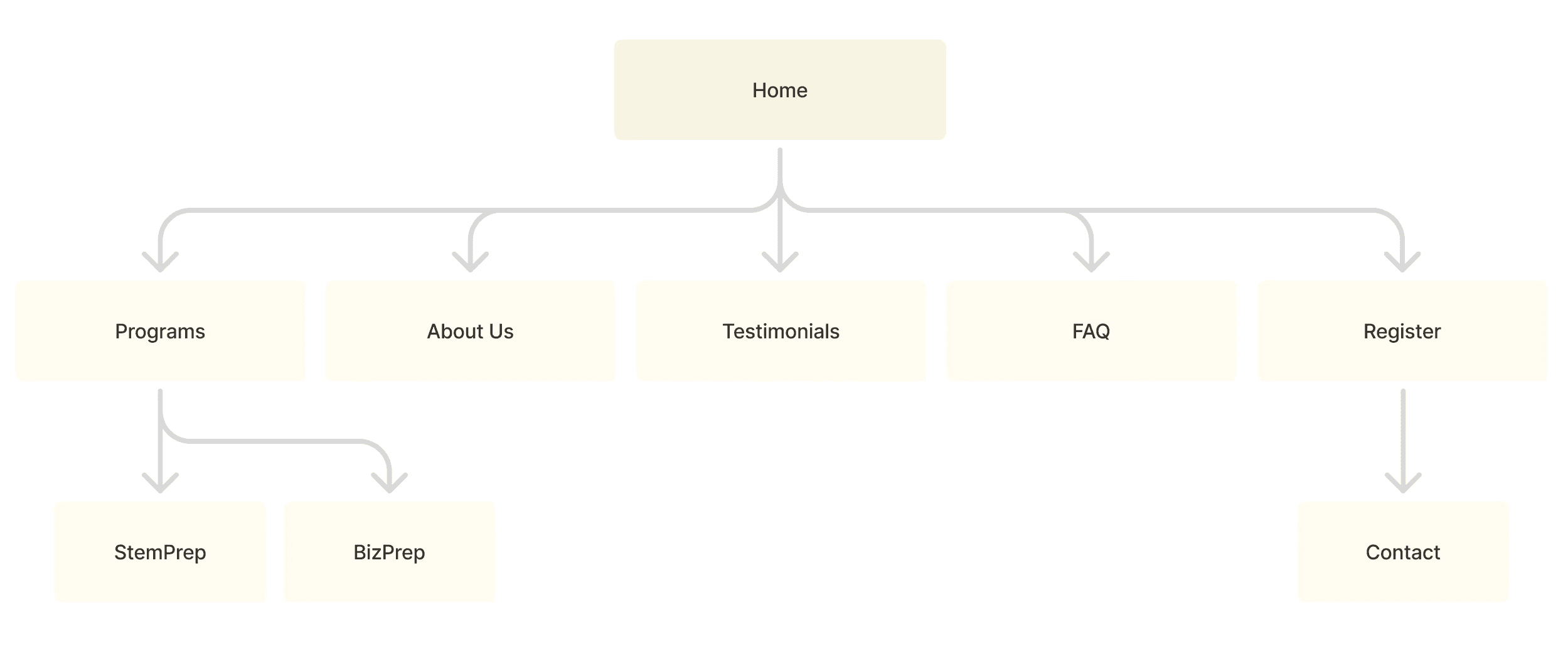
Working closely with the founder, we translated the program vision into a structured digital experience. I mapped the website architecture, established content hierarchy, and designed low-fidelity wireframes that balanced detailed information with a clear enrollment journey.

01

Building the Foundation

Working closely with the founder, we translated the program vision into a structured digital experience. I mapped the website architecture, established content hierarchy, and designed low-fidelity wireframes that balanced detailed information with a clear enrollment journey.

01

Building the Foundation

Working closely with the founder, we translated the program vision into a structured digital experience. I mapped the website architecture, established content hierarchy, and designed low-fidelity wireframes that balanced detailed information with a clear enrollment journey.

02

Designing the Experience

The website was designed to help prospective students and parents quickly understand the programs, compare options, and explore detailed itineraries without feeling overwhelmed. Clear navigation, modular content, and visual hierarchy made complex information easier to digest.

03

Creating a Cohesive Brand

I developed a complete visual identity that unified every touchpoint, from the website and marketing materials to reusable UI components and brand assets. This ensured a consistent experience across digital and promotional channels.

LOGO

COLORS

TYPOGRAPHY

Aa

Red Hat Display

Red Hat Display Bold

Red Hat Display Medium

Red Hat Display Regular

Red Hat Display Medium

COMPONENTS

Primary Button

Secondary Button

Text Link

COMPONENTS

Primary Button

Secondary Button

Text Link

03

Creating a Cohesive Brand

I developed a complete visual identity that unified every touchpoint, from the website and marketing materials to reusable UI components and brand assets. This ensured a consistent experience across digital and promotional channels.

LOGO

COLORS

TYPOGRAPHY

Aa

Red Hat Display

Red Hat Display Bold

Red Hat Display Medium

Red Hat Display Regular

Red Hat Display Medium

COMPONENTS

Primary Button

Secondary Button

Text Link

COMPONENTS

Primary Button

Secondary Button

Text Link

03

Creating a Cohesive Brand

I developed a complete visual identity that unified every touchpoint, from the website and marketing materials to reusable UI components and brand assets. This ensured a consistent experience across digital and promotional channels.

LOGO

COLORS

TYPOGRAPHY

Aa

Red Hat Display

Red Hat Display Bold

Red Hat Display Medium

Red Hat Display Regular

Red Hat Display Medium

COMPONENTS

Primary Button

Secondary Button

Text Link

COMPONENTS

Primary Button

Secondary Button

Text Link

04

Responsive Design

Every screen was designed responsively, ensured students and parents could explore programs comfortably across devices while maintaining a consistent visual language.

04

Responsive Design

Every screen was designed responsively, ensured students and parents could explore programs comfortably across devices while maintaining a consistent visual language.

05

Supporting Marketing Assets

To support the product launch, I designed promotional flyers, email templates, and branded assets that extended the visual identity beyond the website and helped establish a recognizable presence across communication channels.

05

Supporting Marketing Assets

To support the product launch, I designed promotional flyers, email templates, and branded assets that extended the visual identity beyond the website and helped establish a recognizable presence across communication channels.

Reflection

Designing for education meant balancing emotional and practical needs. Students responded to aspiration and excitement, while parents looked for clarity and credibility. Learning to design for multiple decision-makers simultaneously shaped how I approached content hierarchy, branding, and visual communication throughout the project.

Let’s build something great.

Navigation

Let’s build something great.

Navigation

Let’s build something great.

Navigation

04

Responsive Design

Every screen was designed responsively, ensured students and parents could explore programs comfortably across devices while maintaining a consistent visual language.

05

Supporting Marketing Assets

To support the product launch, I designed promotional flyers, email templates, and branded assets that extended the visual identity beyond the website and helped establish a recognizable presence across communication channels.